I want to open the idea that our minds are built in a way that anchors thoughts. This happens to a varying degree to everyone. There are those of the oak, and those of the willow. There are benefits to being both rigid at times, unyielding to change, and more times when the willow tree survives as it bends when it must to survive. It’s a great metaphor for life, and it works. Great metaphor for world we are currently living in, and it works. But don’t forget, you can also ‘go rouge’ and pick any tree you want.

Source: iStock/Tetiana Saranchuck
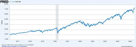
First, the good news. Big picture, everything is going to be just fine…eventually. Betting against America. Betting against our resiliency, innovation, and collective desire to make this place better has been the trade you’ve wanted to be on for decades. This is just the last ten years. But pay special attention to the grayed in area in early 2020. That’s the pandemic recession and it’s the reason we are where we are in terms of the crushing inflation of today. More on that later.
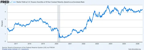
On to government issued bonds, the ten year has been rock solid for four years after a big dip in yields during the pandemic. With a stable 4% yield on average for three years through blowout spending by the U S of A, a global fight for positioning, and a whole shyte ton of other reasons other asset classes have had the chance to party like it’s 1999. More on that later.
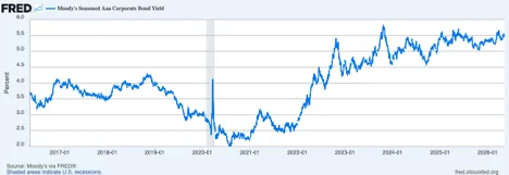
Corporate bonds of the quality kind have also been your friend. This chart shows yields, and it means that prices have held up just fine as well. After the COVID scare, and a couple years more, AAA corporate bonds have averaged 4.5%. That’s three years without hesitation as stocks have ripped higher.
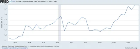
All of this is happening because corporate earnings not only held up, but they too have also been cranking higher for the past three years.
The frightening downside, according to the Case-Schiller P/E ratio, we are running at a 42 multiple. That’s 2 points off the 44 peak we saw at the nadir of the dot.com bubble. And to foreshadow a bit, in this guy’s humble opinion we are 100% in am AI bubble that could frightenedly still be early innings.
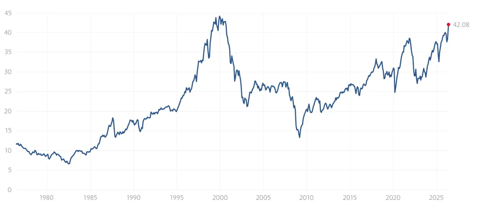
Source: Case-Schiller
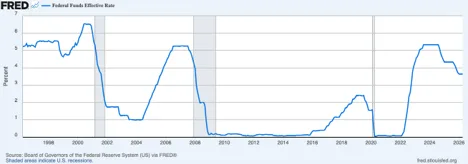
That’s what I have for you in terms of what is has been going right, and it’s a pretty long list. The Pandemic is so far in the rearview mirror that it’s almost as if it never happened. Same for the Global Financial Crisis. That was a looking into the abyss moment, and it blinked, we didn’t. The Fed’s Zero Interest Rate Policy (ZIRP) has been lifeblood, almost literally.
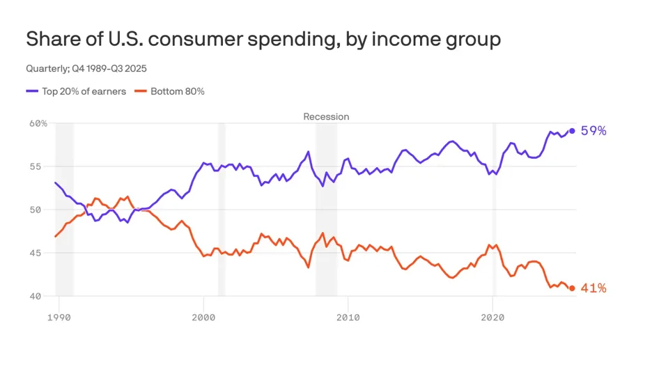
Onward to what is going on in the underlying economy and why the S&P 500 and NASDQ have decoupled from what we knew as “reality”. It’s the top decile that own stocks, and its top decile running this show. Gotts love the red, white and blue. Merica’, home of the free because of the brave. Buy em’!!!
Source: St. Lous Federal Reserve Bank
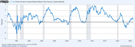
A longer look at the yield curve trade coming off the longest inversion in history, without even a mild recession. This data series goes back 50 years to 1976. That is enough time to develop solid signal. This time it didn’t, and there are myriad reasons for why. Each with its own unique spin.
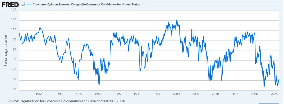
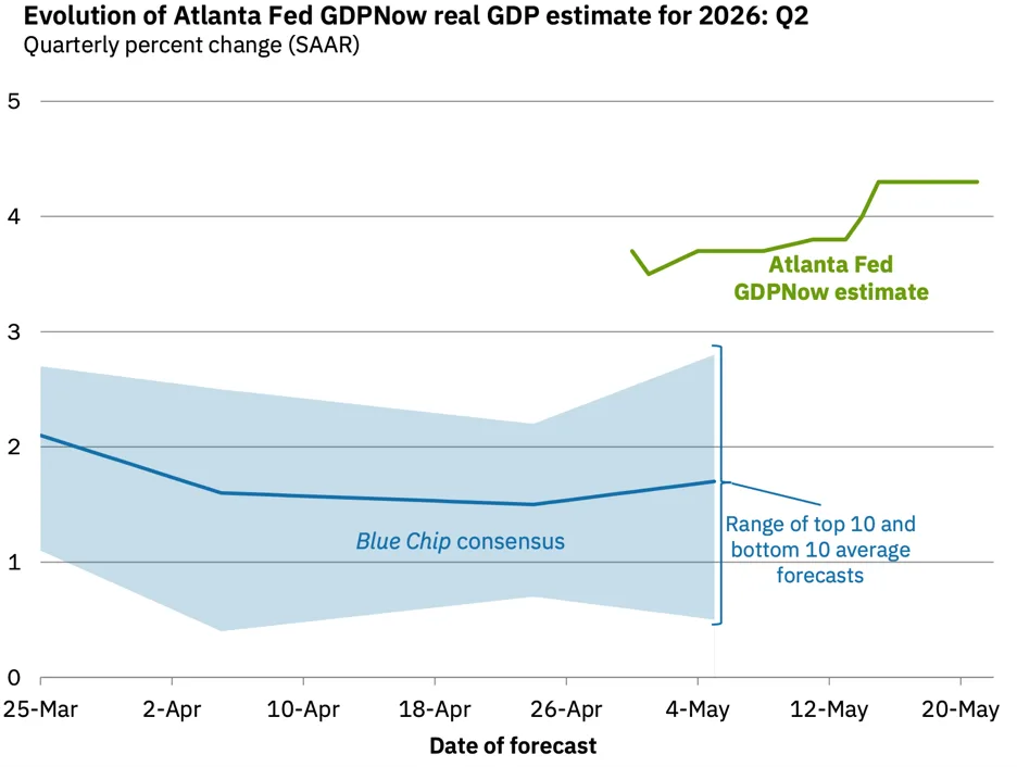
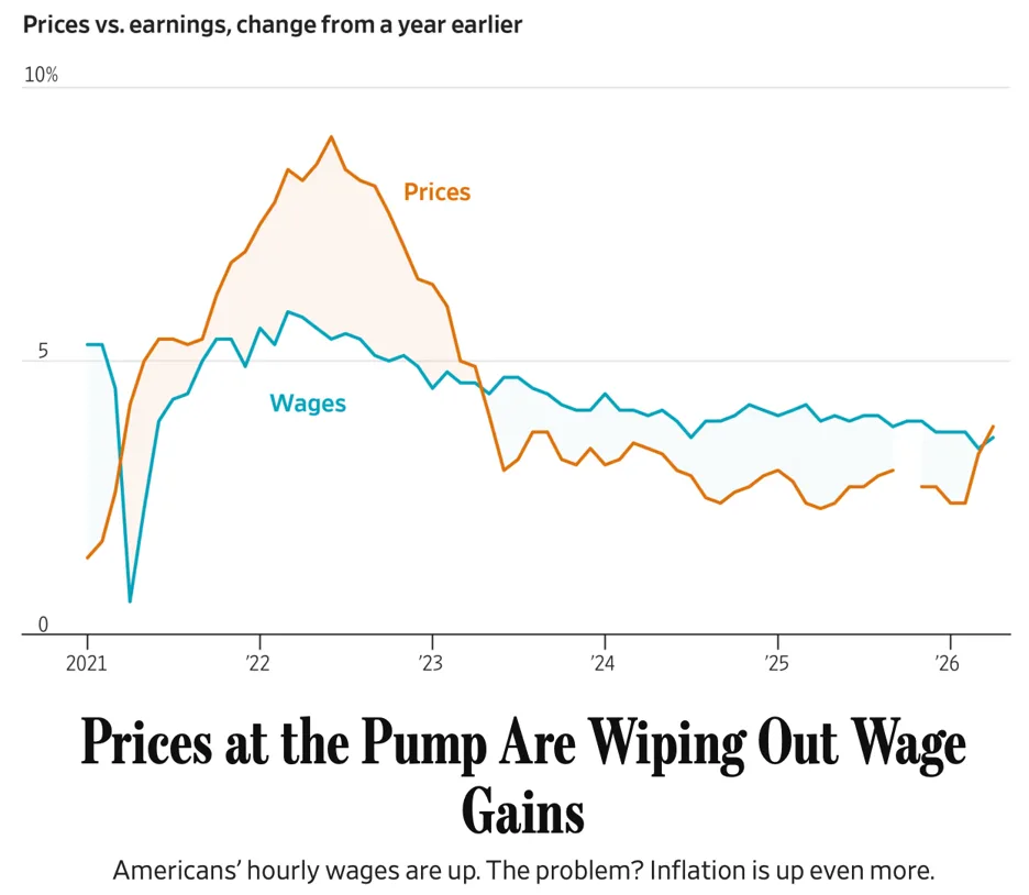
A policy of aggressively ‘winging it’ has caught up with the president in a not small way. Some of it’s due to his own mistakes, others have been compounded from what he walked into. But for better or worse, it doesn’t matter what you inherited. A year in, it’s all yours baby! And it’s all his now.
Source: Atlanta Federal Reserve Bank
This world is spinning so fast that I had to remind myself that if I had a few good friends, a cold Coors in my hand, and trout that want to meet me but don’t know it yet, I was going to be fine. Nirvana, if not just for a brief window of time. IYKYK.

Source: iStock/yayayoyo
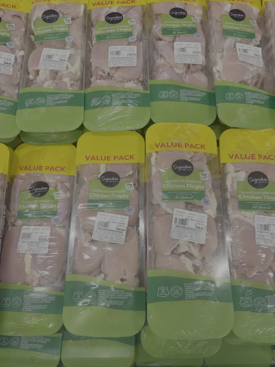
The situation is such that I spend a good ten minutes in the chicken department of Safeway in Burlingame, CA on Wednesday. These are boneless thighs, the everyman’s chicken. Not even one of these had anything less than a $16 handle, and one was priced north of $24.
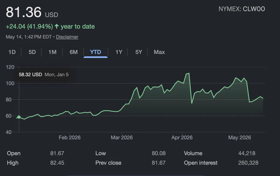
Another mistake, and it’s not a small one, was the belief by those in the room when Donny decided to follow Benji’s lead and attack Iran because of ‘imminent threat’ that there was not a Strait of Hormuz? Seriously, did y’all not understand that the takeout of the Ayatollah was going to wrap this thing out? I watch a lot of what Anthony Scarmcuti says on the Insta, and he paints a brutal picture of how the decision making took place. And now we have this to deal with.
Source: Yahoo Finance
And more importantly, this to deal with…
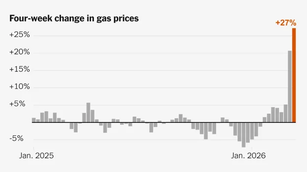
Source: AAA
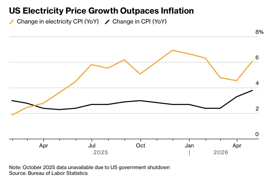
But it’s not just gasoline, electricity is also cramming down pain on everyone. Energy is everywhere and not a single person you will see today, tomorrow, or forever in the future will be immune to spikes in prices.
And now, the chart…
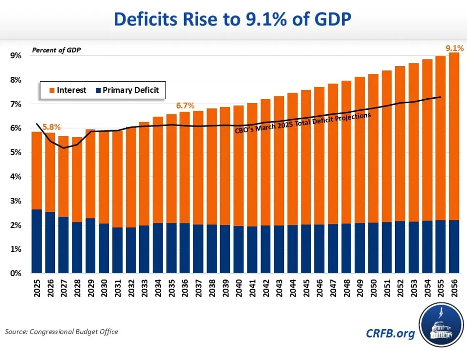
Last item before we get to bubble fun and stock speculation, the federal deficit. This is a long term problem that my kids, and their kids are going to be dealing with. I’m 54 and maybe I start to see it at 84, but who knows. We kick a good can around here. That said, if we keep the economy on the rails, we will be okay, but just okay. It’s the interest on the debt that is going to kill us.
Source: The Federal Reserve Bank
And finally, the housing bubble(s).
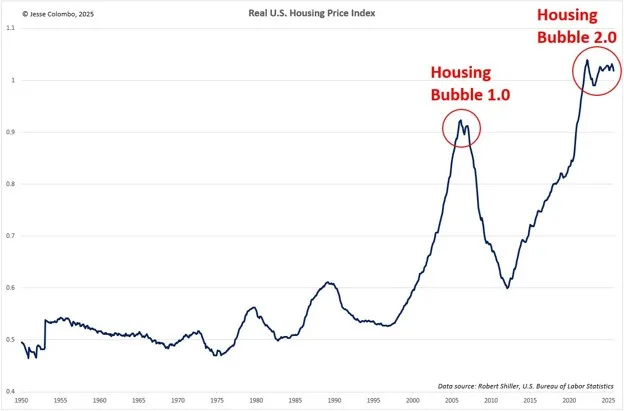
Full disclosure, I’m not a hater of bubbles. I lot of people I know have made a lot of money during them. And a lot are making it now. We aren’t talking Piper Cub money; we are talking PJ money. Like the big kind.
Onward to the stocks that are currently ‘working’ and are in charge of the indexes by virtue of their weighting. Here we have Microsoft, Amazon, Meta, Google, and Oracle.
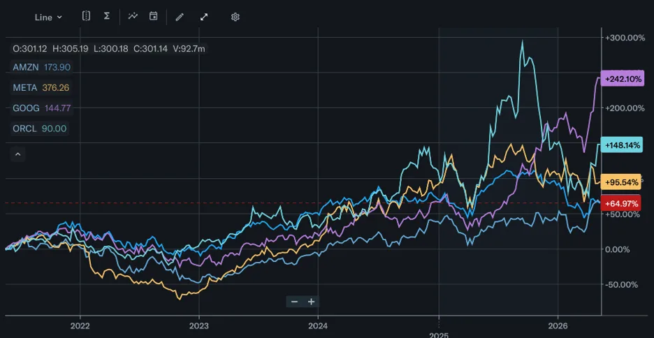
Source: Yahoo Finance.
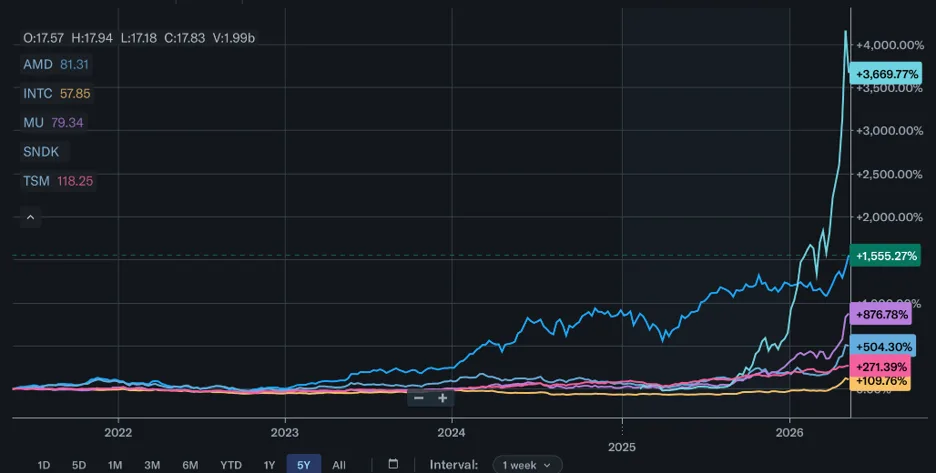
This is an overly of a NVDIA chart, and SanDisk blows the perspective up. While it’s now up 3,669% and is your Iomega of this bubble, NVDIA is up 1,555%, Intel 109%, Micron 876%, AMD 504%, and Taiwan Semi 271%.
Importantly, if you are looking for a sign of a bubble, look for parabolic moves like this. While the AI story has been playing out for a while, the chips that are going to power this thing only took off this year. Only a few months ago.
Source: Yahoo Finance
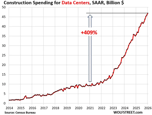
One last parabolic chart to show you, and that is of capital spending on the actual build out of AI date centers. If those numbers are correct, and the come from the BLS so I think they are, $15 billion was spent on construction in 2023. Two and a half years later it’s tripling to $50 billion. Give or take $5 billion.
With that, I bid you au revivor as the French would say. Aside from a goodbye, it also means ‘we will see each other again.’ This differs dramatically from adieu, which has some finality in it. But until we enjoy our time together once more, go out there into this brave new world and be the tree you want to be. For its springtime in Paris, ooh la la, ‘I wish that I knew now, when I was older’.

Source: iStock/Elena Zolotova